
Flexbox VS Bootstrap; Website creation gains more important nowadays. 70% of professionals and business owners use websites to promote their brands. To get more visibility, websites built by developers should have attractive and responsive designs. As user interface has improved using responsive designs, many website developers use either Flexbox or Bootstrap to build customer-oriented websites.
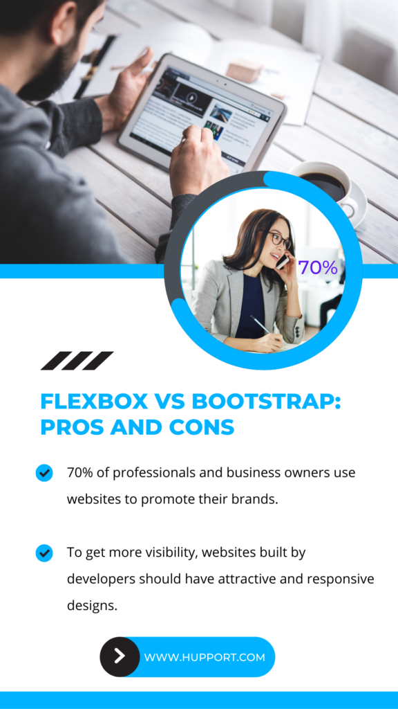
Flexbox VS Bootstrap: PROS AND CONS
Here you get to know the more appropriate and suitable responsive layout for your website creation. Comparison is made on the elements of design and compatible other features.
Flexbox VS Bootstrap
|
Design& features |
Flexbox |
Bootstrap |
| Framework | Open source CSS layout method | Free and open-source front-end framework |
| Definition | Flexbox is CSS web layout model | Bootstrap is a development framework to create websites and web apps |
| Developer | CSS working group | Bootstrap core Team |
| Support | Enables websites to work in different environments with provided essential features | Boot means a small loading program in modern browsers. This is similar to the operating system. But using CSS extra elements managed to fix cross-browser issues |
| Usability | To align, distribute space, and arrange web pages | To create, design, and build websites and web apps |
| Flexibility | Flexbox as the name suggests super flexible and customizable form-fill layout (polyfill) | Bootstrap is less flexible comparing Flexbox; it has prebuilt alignments and containers to use. You can go for customization also. (not polyfill) |
| Structure | Front end development | View-view controller |
| Compatibility | Cross-browser compatibility | Supports in major and modern browsers |
| Integration | Integrated with various tools | Integrated with different tools and IDE(Integrated Development Environment) |
| Data binding | Not easily possible | Easily possible |
| Licensed by | Licensed by MIT | Licensed by MIT |
| Layout | One dimensional layout | Multidimensional layout |
| Size adjustment | Fit to the size of available space(increase or decrease to the rows and columns) | Use multiple containers to fill the space |
| Responsive module | Modern enough to create a responsive module | The layout module is prebuilt and default |
| Grids | No additional support is needed but adjusts the height of grids | Using floats allows choosing an item’s size. |
| Design | Both CSS and HTML | CSS |
| Coding | Flexible coding | Predefined ready to use default codes |
| Meant for | Meant for the smaller community than Bootstrap | Has larger community and Twitter team as it is developed by Twitter |
| Accessibility | Unique but easy access than Bootstrap | Easy access |
Key differences between Flexbox and Bootstrap
Flexbox and Bootstrap cannot be compared. It is because Bootstrap uses Flexbox to design layout in Bootstrap 4. Both layout modules are quite famous in the market and have huge users in the market. Developers also use either framework in website construction and web application creation.
Accessibility
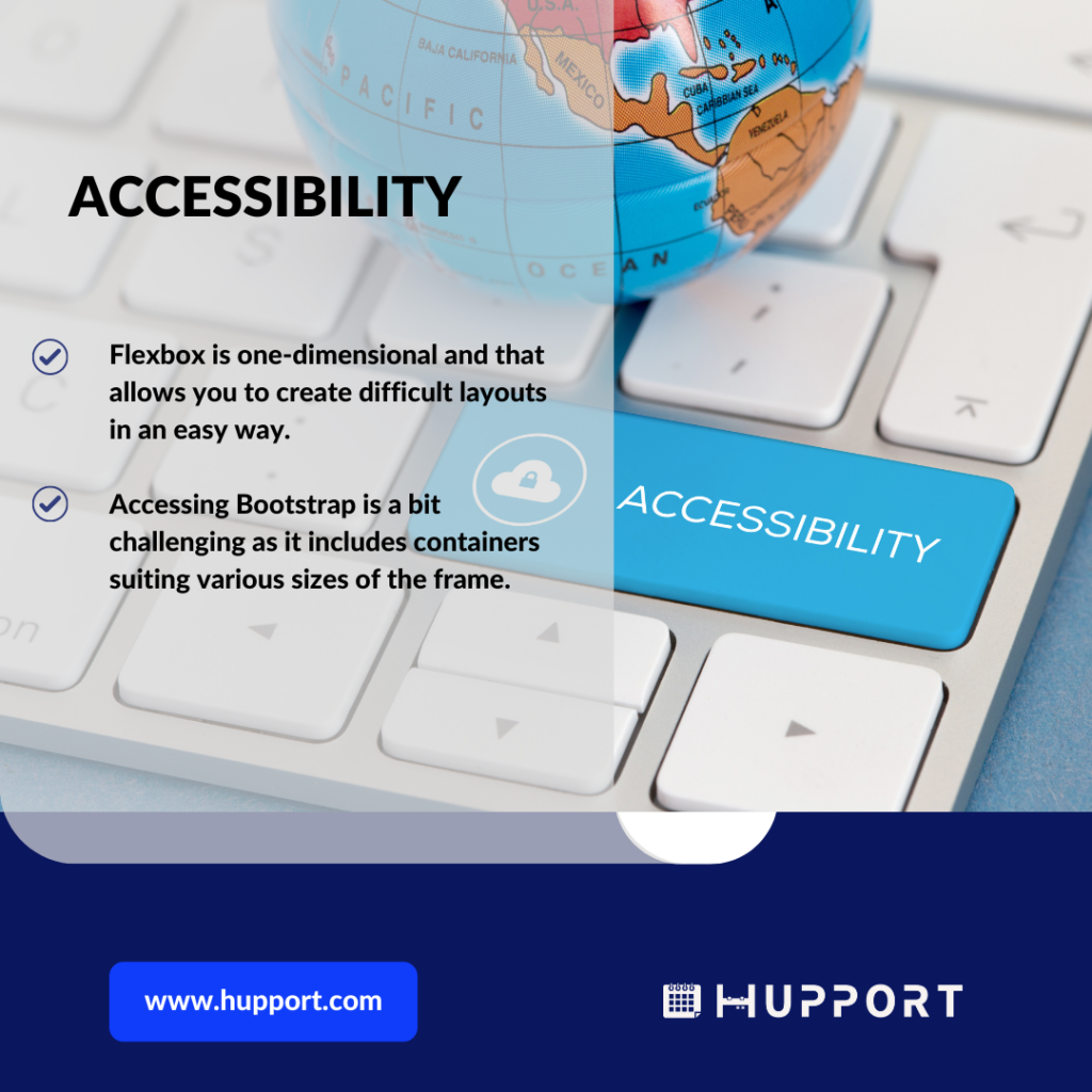
Accessibility
Flexbox is one-dimensional and that allows you to create difficult layouts in an easy way. Website developers find Flexbox as easily accessible and user-friendly design. There is no separate coding or program is used to increase or decrease the size of the framework. It has a form-fit feature that suits automatically the available size.
Comparatively, this is not the case with Bootstrap. Accessing Bootstrap is a bit challenging as it includes containers suiting various sizes of the frame. Bootstrap using website developers should find any of those containers of needed size to fit in their need. Bootstrap is actually an easily accessible layout module. But the comparison is between Flexbox and Bootstrap and that’s what shows Bootstrap access is a bit complex.
Responsive layout
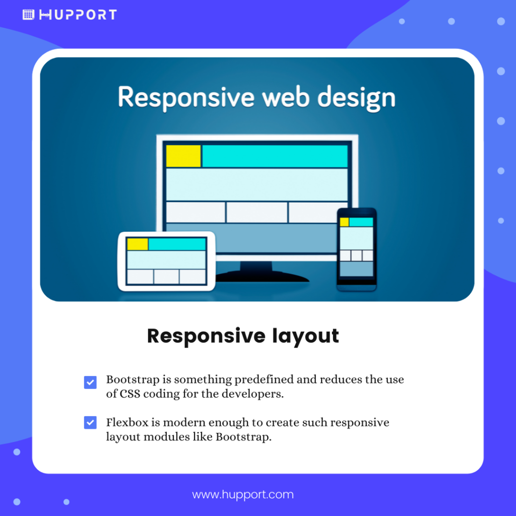
Responsive layout
Regarding the responsive aspect of these two frameworks, Bootstrap is something predefined and reduces the use of CSS coding for the developers. At the same time, it does not stop with those pre-defined or pre-built layouts. It allows developers to have customization wherever it is needed. It saves time as no separate coding is required for various sizes and devices. Thus the developers find Bootstrap more responsive.
Many website developers think that Flexbox is outdated to respond to the user devices. But the truth is, it is modern enough to create such responsive layout modules like Bootstrap. It can also allow customization to the devices and size of the framework accordingly. So, here is a neck-to-neck performance in the responsive layout aspect.
Grids
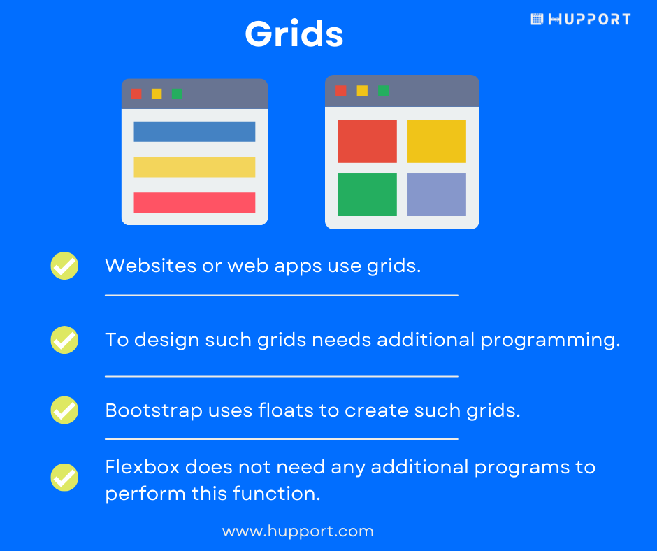
Grids
Websites or web apps use grids. To design such grids needs additional programming. Bootstrap uses floats to create such grids. Flexbox does not need any additional programs to perform this function. It is totally opposite to Bootstrap as it is flexible to the item’s available size on its own. It never has any prebuilt coding to create grids like Bootstrap.
Bootstrap using floats does padding and setting accordingly to the pre-defined size. It needs to fix every row of the grid. If not, it gets misaligned to different heights. Flexbox as it is not using floats finds the height and stick to the height automatically.
Suitability
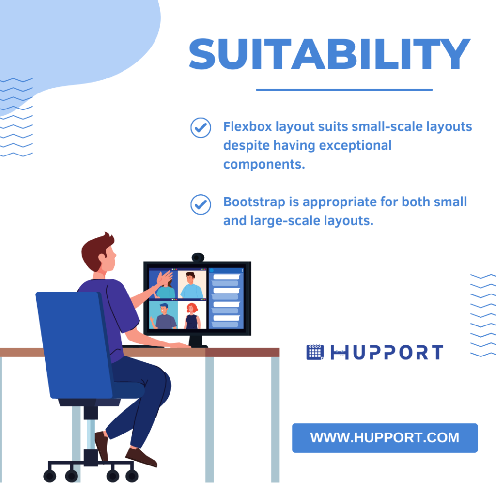
Suitability
Flexbox layout suits small-scale layouts despite having exceptional components. Bootstrap is appropriate for both small and large-scale layouts. Utility and performance is higher for Bootstrap. There is one underlying reason that it uses Flexbox also as its core component. Thus performance competence cannot be judged. Suitability and appropriateness is what makes the difference here.
Cross-browser issues
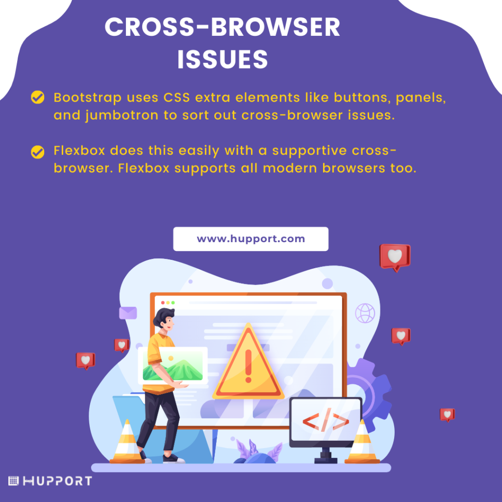
Cross-browser issues
Bootstrap uses CSS extra elements like buttons, panels, and jumbotron to sort out cross-browser issues. Boot means small initial loading software in any operating system. Thus it enables to load websites in modern and majority of the browsers used by users. There is one unresolved thing about Bootstrap is this cross-browser issue. Cross-browser is enabling the website, HTML construct, apps to work in different environments with provided essential features. Flexbox does this easily with a supportive cross-browser. Flexbox supports all modern browsers too. This is one cool element in using Flexbox.
Elements and properties
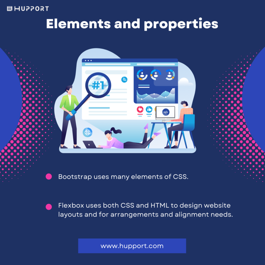
Elements and properties
Bootstrap uses many elements of CSS. It creates or allows the developers to create responsive layouts with those features. Flexbox never uses any such CSS extra features or properties to help in designing websites or web application layouts. Flexbox uses both CSS and HTML to design website layouts and for arrangements and alignment needs.
Structure
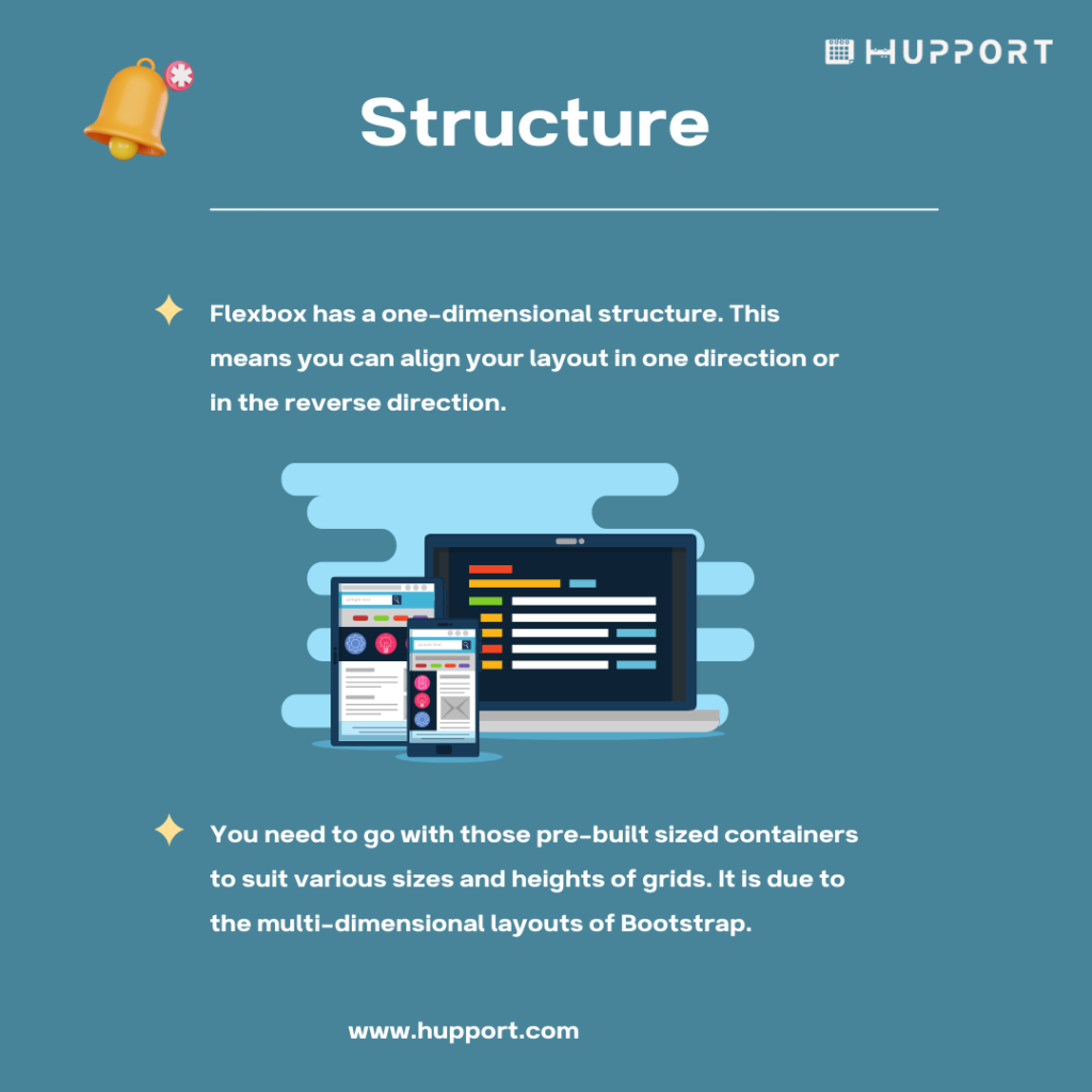
Structure
Flexbox has a one-dimensional structure. This means you can align your layout in one direction or in the reverse direction. It is generally from left to right. Thus it simplifies the process. It is the reason why Flexbox can form complex layouts in an easy way. It is the descendent of inline. It creates a flexible box to suit the width and height of any size of the container. It can align both vertically and horizontally. This is not that easy with Bootstrap. You need to go with those pre-built sized containers to suit various sizes and heights of grids. It is due to the multi-dimensional layouts of Bootstrap.
Writing codes

Writing codes
Developers need not rewrite codes with Bootstrap. Everything is prebuilt, you need to choose the appropriate style and size from them and embed them into your layouts. When you use anything inappropriate, it misaligns and misarranges the layout. Flexbox allows you to rewrite codes to the developer’s needs. Bootstrap can also show layouts of high resolution in all user devices. Flexbox also does the same. No replacement is allowed as Bootstrap builds everything in prior.
Flexbox
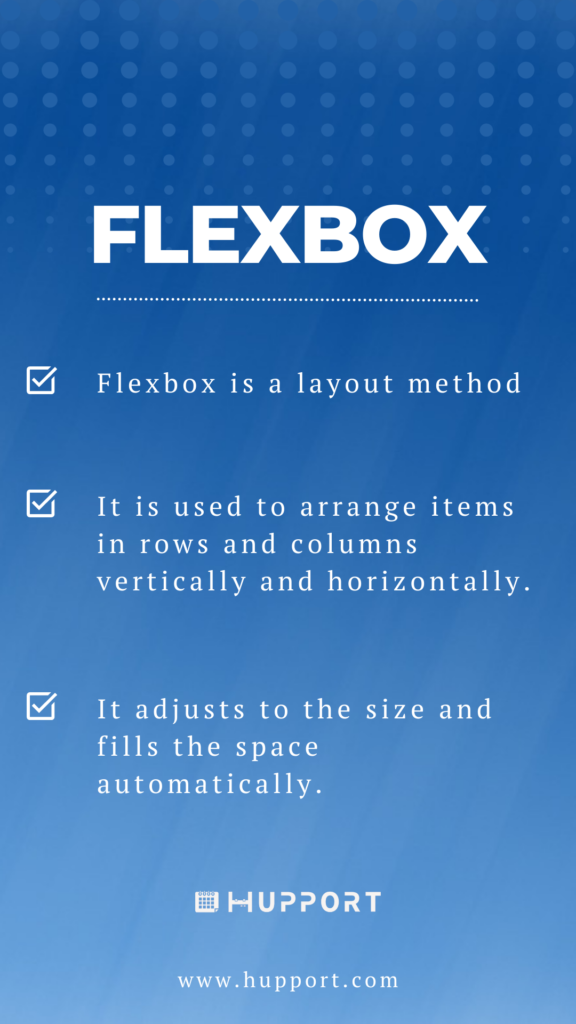
Flexbox
Flexbox is a layout method. It is used to arrange items in rows and columns vertically and horizontally. It adjusts to the size and fills the space automatically. It has a responsive design flexible and adaptive. The very advantage of Flexbox is filling the excess space without using Javascript or additional programming. Thus it is adjusting to the screen size automatically.
In general, it is used to create web pages. Flexbox suits your website by allowing you to format HTML. It is a one-dimensional layout method especially for arranging the layout module. It is actually CSS (Cascading Style Sheets) Flexible Box Layout. CSS and HTML combination is often used to create web pages and styling. The peculiar feature of Flexbox is the form-fit viewable option. It increases or decreases the space and aligns automatically to the available layout space.
PROS of Flexbox
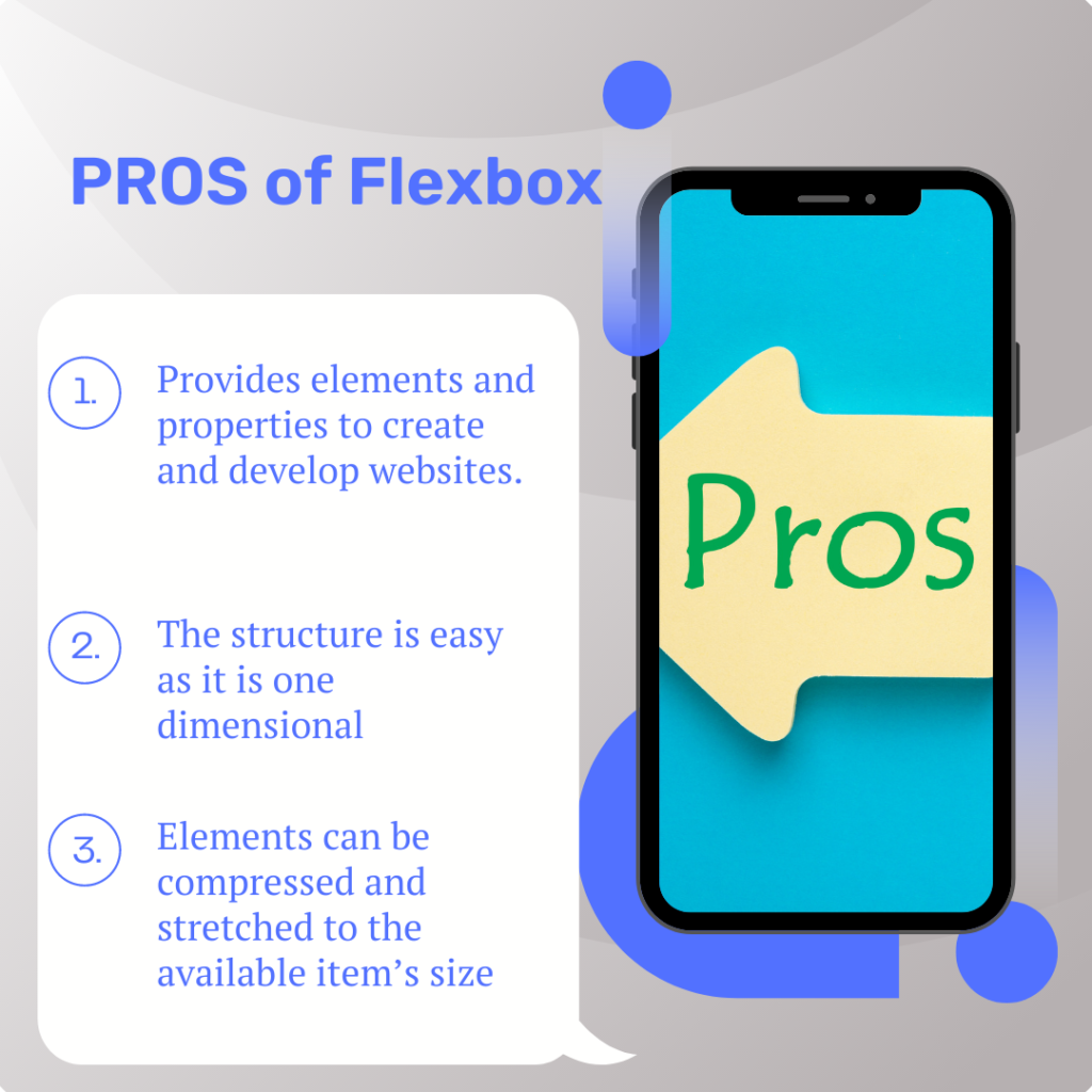
PROS of Flexbox
- Provides elements and properties to create and develop websites
- The structure is easy as it is one dimensional
- Elements can be compressed and stretched to the available item’s size
- Form-fit layout feature suits your layout module perfectly
- Auto alignment option (you can align both vertically and horizontally)
- Uses both HTML and CSS
- Aligns rows and columns automatically
- You can align using one dimension to set it in any alternate directions
- Elements can also be shown in reverse order
- No cross-browser issues
- Modern enough to suit all user devices and item size
- Gives easy access to developers
- Allows customization to the height of the grid
- Open source suits small scale community
CONS of Flexbox
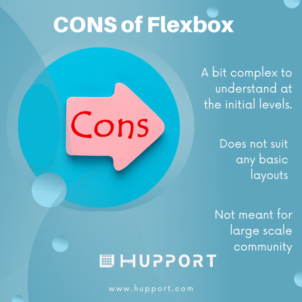
CONS of Flexbox
- A bit complex to understand at the initial levels. (Learning basics will give mastery over the Flexbox framework)
- Does not suit any basic layouts
- Not meant for large scale community
Bootstrap
Bootstrap
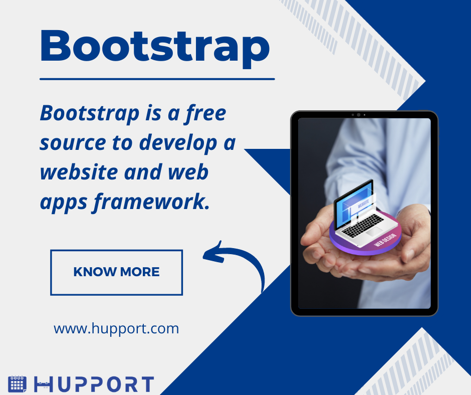
Bootstrap is a free source to develop a website and web apps framework. It is a small program that loads programs in the operating system. Bootstrap is also a CSS framework that includes the specification of Flexbox. Bootstrap is a small web application that you can code for yourself. One can develop and build websites using Bootstrap. Millions of developers use Bootstrap in 40,000+ companies to date. To use Bootstrap, you need not know coding to develop this program. Bootstrap is a pre-defined program that suits all web apps and websites. It is used in all devices and screen sizes or users. Thus it is developer-friendly software.
Many prefer to use Bootstrap than CSS. CSS is complex to understand. It also needs to be developed by the website developer or programmer. But Bootstrap is different as it creates a developer responsive framework and gives easy access to users.
PROS of Bootstrap
PROS of BootstraP
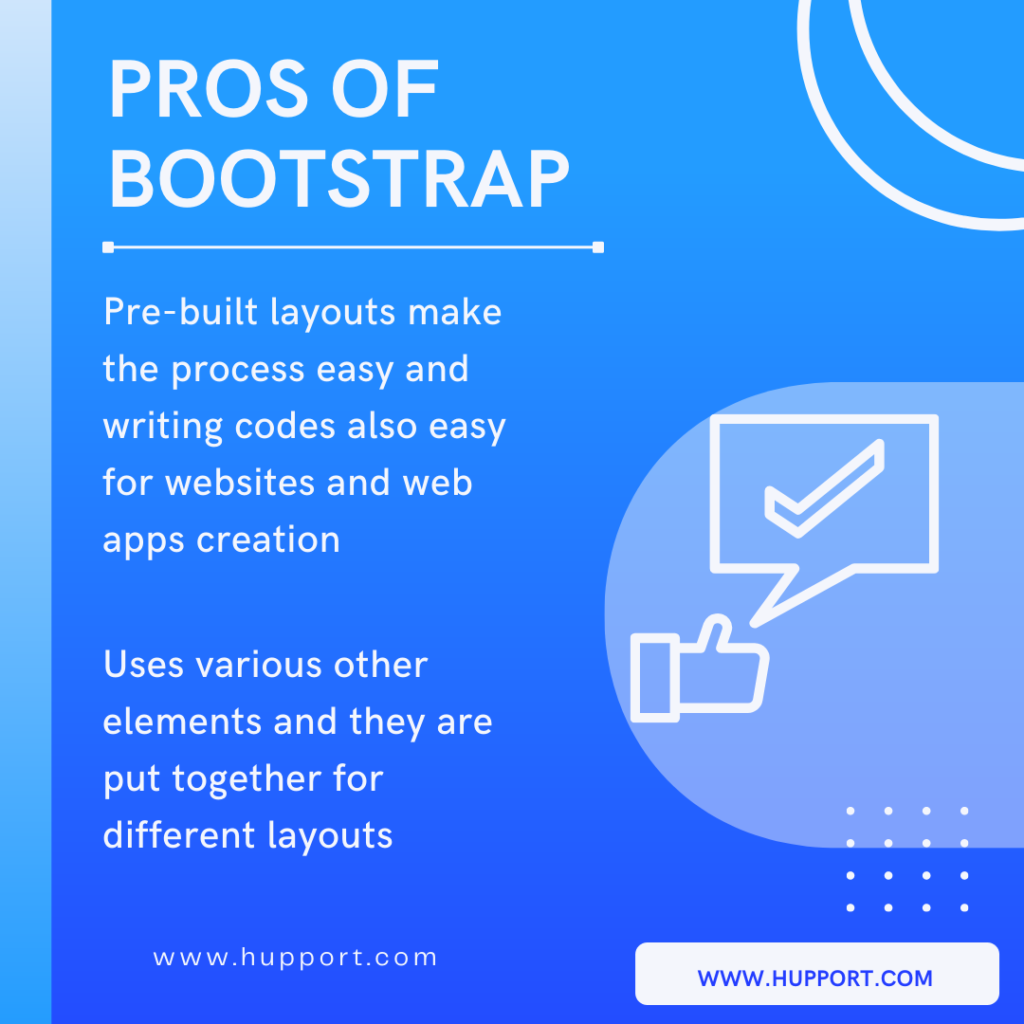
- Pre-built layouts make the process easy and writing codes also easy for websites and web apps creation
- Uses various other elements and they are put together for different layouts
- Given instruction to use the layouts makes the process very understandable and easy
- It is free to open source on the network to work with website creation
- Not only developers any beginners can work using appropriate instruction
- Bootstrap improves its elements and performance consistently
- Comes with more elements and properties for upcoming users
- Suits both large and small scale community
- Pre-built layouts help to align better
CONS of Flexbox
- Zero customization with those prebuilt designs and styles of layouts. This is one aspect that developers do not like about Bootstrap
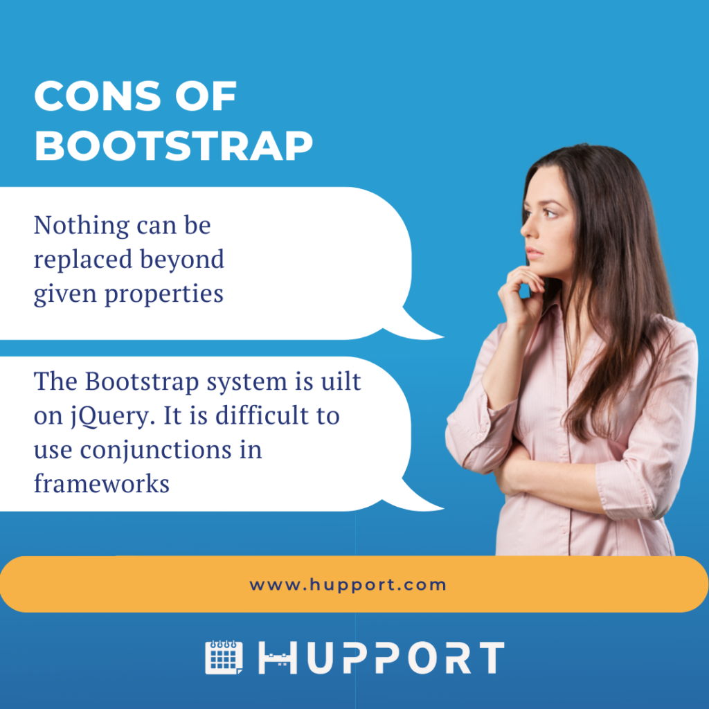
- Nothing can be replaced beyond given properties
- The Bootstrap system is built on jQuery. It is difficult to use conjunctions in frameworks
- Deals with cross-browser issues which do not support in different environments. To cope with this, it uses extra programming.
To conclude, you cannot say either Bootstrap or Flexbox is better than one another. It is because; Flexbox is not an alternative to Bootstrap and vice versa. Both serve similar purposes with different elements and properties. You cannot compare two things has completely different grounds. They are convenient and work the best in their own way. As told earlier, Bootstrap itself uses Flexbox in its 4th version. Now they become integral parts of each other. They cannot be seen as two different frameworks anymore. Both are responsive website design and style elements and there is no definite answer.
